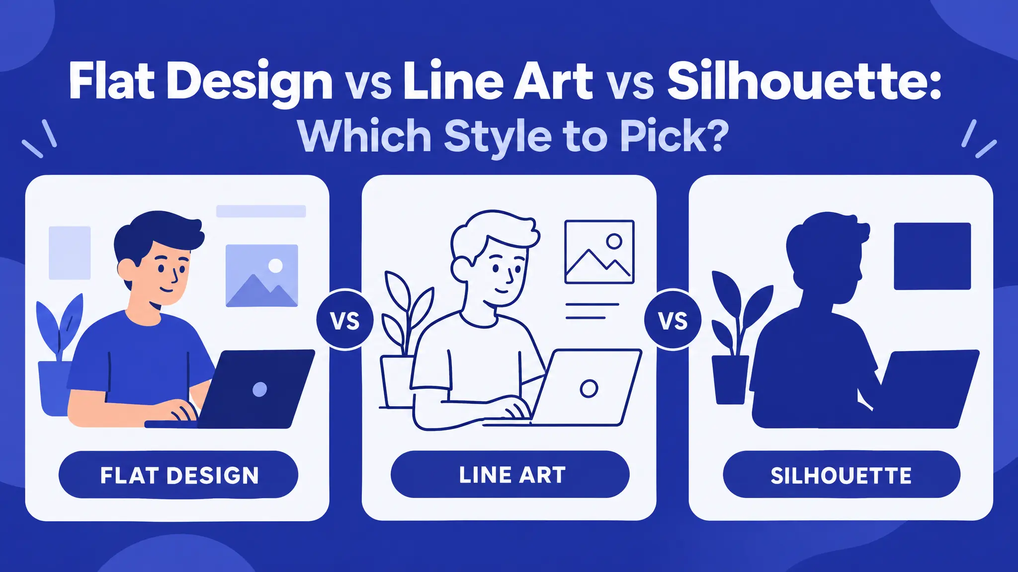
These three terms get used loosely, but they describe different things. Picking the wrong one is a common reason a finished design feels “off” without anyone being able to say why. Understanding flat design vs line art vs silhouette helps you choose graphics that look right for your brand, your product and the size they’ll be seen at.
This guide explains each style, where it works best, where it struggles, and how to choose.
Flat design
What it is
Flat design uses solid blocks of color with no shading, gradients or outlines to create depth. A shape is just a shape, filled in.
What it says
Modern, friendly and easy to understand. That’s why it’s the default style for app icons, explainer graphics, infographics and most tech company websites.
Strengths
- Easy to read at a glance
- Works well in color-heavy designs
- Great for icons, infographics and illustrations for websites and apps
- Prints well with any printing method
Weaknesses
- Can feel generic, especially with default color palettes, because so much of the internet already looks like this
- Multi-color flat designs need several vinyl layers for cutting machines
Best for
Websites, apps, presentations, infographics, kids’ products, stickers and playful brands.
Collections to try: Christmas Cartoon Icons, Healthy Lifestyle Icons 01, Funky Animals 01, Tropical Cocktails 01
Line art
What it is
Line art builds the image entirely from strokes: no fill, or only a little. The lines themselves carry all the detail and personality.
What it says
Editorial, handmade or upscale. Line weight and line style are much harder to fake than a flat color block, so line art feels designed rather than templated.
Strengths
- Elegant and timeless
- Uses little ink, which is great for printing
- Easy to recolor (often just one color to change)
- Engraves beautifully with a laser or woodburning tool
Weaknesses
- Very thin lines can disappear at small sizes
- Fine details can be hard to cut or weed on vinyl
- Can look empty on busy backgrounds
Best for
Stationery, menus, apparel, wall art, wedding designs, botanical and vintage-style branding, and engraving.
Collections to try: Kitchen Essentials Outline, Cottage Line Art, Apres Ski Line Art, Simple Wildflowers 01
Want ideas? Read Wildlife Line Art: Bringing the Outdoors Into Your Designs.
Silhouette
What it is
A silhouette is the simplest of the three: one solid shape with no inside detail, defined entirely by its outline.
What it says
Bold and instantly recognizable. It works at almost any size, which makes it the right choice when recognizability matters more than detail.
Strengths
- Readable from far away and at tiny sizes
- Perfect for cutting machines: one shape, one color, easy weeding
- Cheapest to print (one color)
- Works as logos, icons, stencils and window decals
Weaknesses
- No room for detail or expression
- The subject must have a recognizable outline. A cat works; a cup of coffee seen from above doesn’t.
Best for
Logos, favicons, vinyl decals, window clings, stencils, T-shirts and signs.
Collections to try: Santa Silhouette 01, Cowgirl Silhouette 01, Head Styling Silhouette, Halloween Essentials 01
Quick comparison
- Detail: flat design medium · line art high · silhouette none
- Colors: flat design several · line art usually one · silhouette one
- Works tiny: flat design fairly well · line art poorly · silhouette very well
- Cutting machines: flat design needs layers · line art depends on line thickness · silhouette easiest
- Mood: flat design modern and friendly · line art crafted and elegant · silhouette bold and iconic
How to choose: three simple rules
- If it needs to work very small (a favicon, app icon or social avatar), choose silhouette. Detail disappears at small sizes whatever the style, so simplicity wins.
- If the brand should feel crafted, personal or a little vintage, choose line art. It’s the style most connected with hand-drawn, non-mass-produced work.
- If the brand should feel current, friendly and easy to scan (think onboarding screens or feature graphics), choose flat design.
Making something to cut? Silhouettes are the easiest. See how to cut SVG files in Cricut Design Space.
The one mistake to avoid: mixing styles
Don’t mix all three in one project. A page with a flat-design icon, a line-art divider and a silhouette logo looks inconsistent, even if each graphic is good on its own.
Pick one style per project and stay in it. Using a different style for a different placement is fine, like a detailed line-art illustration in a blog header and a simple silhouette as the favicon, as long as it’s a deliberate choice for each placement and not whatever happened to be available.
For more on staying consistent, read How to Build a Brand Kit From Themed Vector Collections.
What about other styles?
- Doodles and hand-drawn sketches: loose, casual lines. Great for planners, cafés and kids’ products. Try Christmas Doodles or Quick Marker Sketches.
- Tattoo flash: bold outlines with flat color. See tattoo flash styles explained.
- Primitive and cave art: rough, simple figures. See primitive art in branding.
FAQ: flat design vs line art
Which style is best for a logo? Usually silhouette or simple flat design, because logos need to work at very small sizes.
Can I turn line art into a silhouette? Sometimes. In a vector editor you can fill the closed shapes of line art to create a solid version, but it doesn’t work for every design.
Which style is easiest to print? Silhouette and line art, because they usually use one color.
Can I change the colors of any of these styles? Yes, with the SVG version. See how to recolor an SVG.
Pick your style
There’s no best style, only the best style for your project. Think about where the design will appear, how big it will be and how you want people to feel. Then browse our collections and find a set in the style that fits.