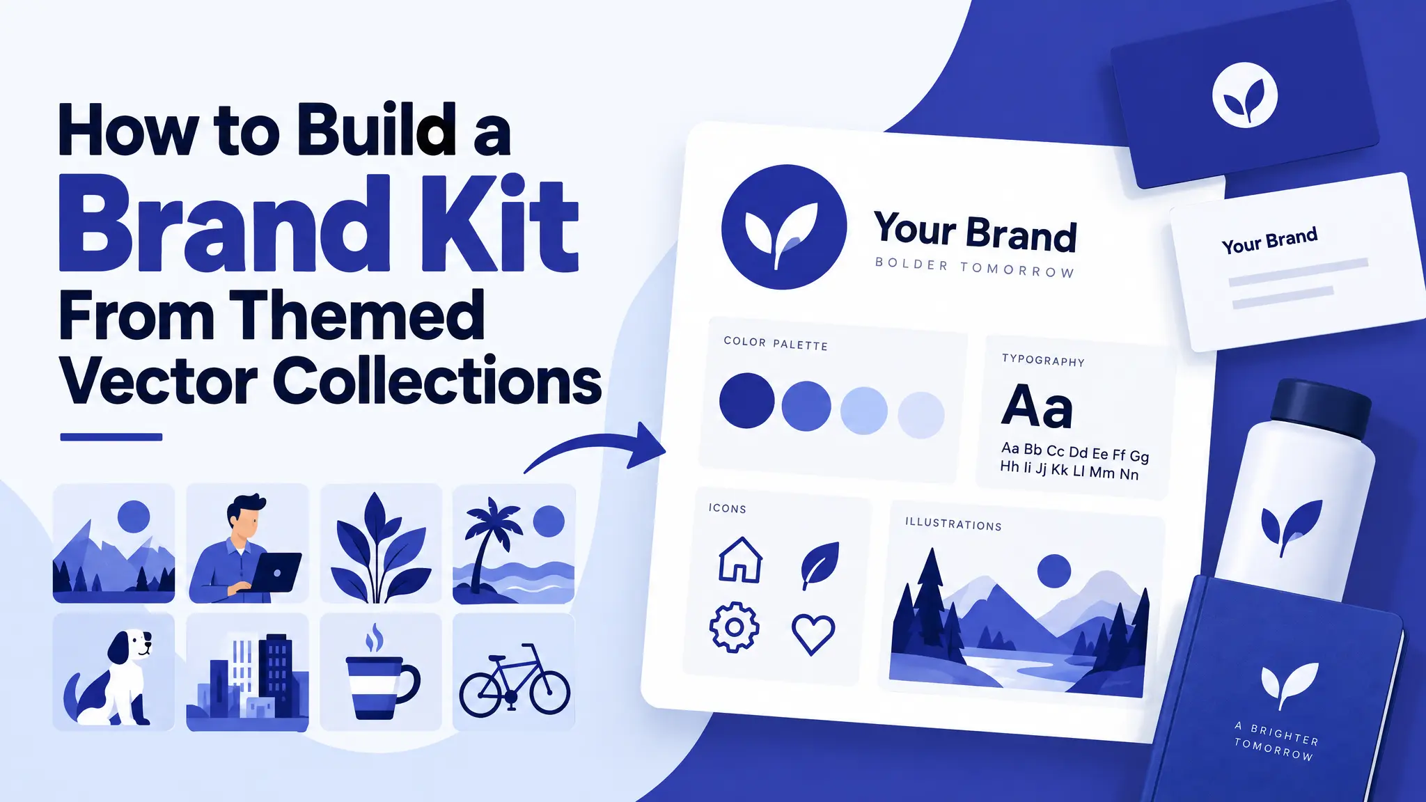
Most small brands don’t need custom illustration to look cohesive. They need restraint, and a simple brand kit. One well-chosen themed collection, used consistently, does more for brand recognition than a big library of mismatched graphics ever will.
This guide shows you how to build a simple brand kit from a single vector collection: your logo mark, supporting graphics, colors, fonts and placement rules. Then you’ll apply it to everything from social posts to packaging.
What is a brand kit?
A brand kit is a small set of visual rules and assets that you use every time you create something for your business. It usually includes:
- A logo or logo mark
- Brand colors (with exact hex codes)
- Fonts for headings and body text
- Supporting graphics, like icons, patterns and illustrations
- Usage rules: how and where everything is placed
With a brand kit, every new flyer, post or label takes minutes instead of hours, and everything looks like it belongs together.
Step 1: Start with one collection, not one graphic
A themed set, built around one subject in one consistent style, gives you a ready-made visual language: the same line weight, level of detail and mood across dozens of images. That consistency is the whole point. It lets you use a different graphic on every product without the brand looking scattered.
How to choose:
- Match your business: a café might use Coffee Club Design or Breakfast Club Design; a bar, Bar Essentials 01; an outdoor shop, Outdoorsy Kit 01.
- Match your personality: clean line art feels calm and modern; cartoon styles feel friendly; tattoo styles feel bold.
- Check the size: a collection with 20+ graphics gives you enough variety for a year of content.
For the difference between styles, read Flat Design vs Line Art vs Silhouette.
Step 2: Pick your primary mark
Choose one graphic from the collection, usually the simplest and most recognizable shape, as your logo mark or icon. It will appear smallest and most often: as your favicon, social media avatar and in the corner of packaging. Recognizability matters more than detail.
Test it:
- Shrink it to 32×32 pixels. Can you still tell what it is?
- Print it in one color, black only. Does it still work?
- Put it on a dark and a light background. Is it clear on both?
Note: you can use our graphics in your brand, but you can’t register them as a trademark. If you plan to trademark your logo, use the collection as inspiration for an original mark. See our licensing guide.
Step 3: Choose a small supporting set
Pick three to six more graphics from the same collection for section dividers, packaging illustrations and social post accents. Keeping this set small and deliberate, instead of treating the whole collection as fair game, is what keeps a brand kit feeling curated rather than random.
Example for a bakery using Kitchen Essentials Outline:
- Primary mark: a whisk
- Supporting set: a rolling pin, a mixing bowl, an oven mitt, a cupcake and a wheat stalk
Step 4: Set your colors
Pick 2–3 main colors and 1 accent color. Write down the hex codes and use them everywhere.
- Pull colors from your graphics if they’re already colored.
- If they’re line art, choose colors that fit your mood: earthy tones for natural brands, bright colors for playful brands, dark and gold for premium.
- Recolor the SVGs to your exact brand colors. Here’s how to recolor an SVG.
Step 5: Pick two fonts
- A heading font with personality that matches the graphics (a rounded font for cartoons, a serif for elegant line art, a bold condensed font for tattoo styles).
- A body font that’s simple and easy to read.
Two fonts are enough. Three is the maximum.
Step 6: Define one placement pattern
Decide once how graphics are used, and repeat it everywhere:
- Always in the top-left corner, or always centered
- Always at a set size compared to the text
- Always in one color, or always in your accent color
The graphic can change; the way it’s placed shouldn’t.
Step 7: Build your digital assets first
Once the rules are set, create:
- Social media templates: posts, stories and highlight covers
- Website elements: favicon, icons and section dividers
- Email header and signature
- Business card
Transparent PNGs make this easy. See how to use transparent PNG files anywhere.
Step 8: Extend into packaging and print last
Once your digital kit is settled, the same collection usually translates easily to physical items, because you’re not making new design decisions, just reapplying ones you’ve already made:
- Packaging tape and stickers
- Thank-you cards and care instruction tags
- Shipping labels
- Product labels and hang tags
- Signs and window decals (use the SVG for large sizes)
The five-asset test
Here’s a simple way to check whether your brand kit works. Show someone five assets: a social post, a package sticker, a business card, a website icon and a label. Don’t tell them they’re related. Ask whether they’d guess they’re from the same brand.
If the answer is a quick yes, the collection-first approach did its job. If not, the usual fix isn’t more graphics. It’s fewer, used more consistently.
Brand kit examples by business type
- Cocktail bar: Fancy Cocktails 01. Read more in cocktail vector art for bar branding.
- Outdoor brand: Mountains Artwork. See wildlife line art ideas.
- Sports club: Pickleball Kit 01. See club merch ideas.
- Wellness studio: Healthy Lifestyle Icons 01
- Craft or tattoo-inspired brand: Oldschool Tattoos 01
FAQ: brand kit
Do I need a designer to make a brand kit? No. With one themed collection, a free tool like Canva and the steps above, you can build a solid brand kit yourself.
Where should I store my brand kit? Keep it in one shared folder with your logo files (SVG and PNG), a document listing your colors and fonts, and your templates. Canva’s Brand Kit feature also works well.
Can I use your graphics for my business brand? Yes, with a Pro plan, which includes a commercial license and no attribution requirement. Just don’t register them as a trademark.
How often should I update my brand kit? Rarely. Consistency builds recognition. Small updates every few years are fine; big changes should be rare.
Keep it simple
A strong brand isn’t about having more graphics. It’s about using a few graphics the same way, every time. Pick one collection from our collections, follow the steps above, and your brand will look like it was designed on purpose.